Category | June 05, 2021

We all emit or lets say radiate! Our emotions – happiness, sadness, eagerness, holding-back, lust, disapproval, etc. and worse! Sometimes our actions and ambience we are in either compliments our radiations or contradicts them and neutralizes them.
That’s how colours play a pivotal roles in our lives. What we wear, and where we choose to wear them. Surprisingly, we don’t notice all the actions and their variable reactions happening right in front of us! We are an emotive specie. We love to express, whether we are doing it intentionally or unintentionally; or let’s say non-intentionally (when we don’t want to but it happens or we are forced to and/or vice versa)
So, how do colours and patterns of fashion play an important role in our lives? Most of us have choices in the colours we wish to wear, but, did you know? Your choices also talk a lot about you and your current state of mind?
Let’s have a sneak peak and who knows? Maybe we will understand when we will get lucky, the next time we are using this knowledge or what others are thinking about you, eh? wink wink** (pun intended)
I will be talking about the following general colours:-- Black
- Brown
- Blue
- Red
- Pink
- Grey
- Yellow
- Orange
- Green
- White
So, here, you will understand about the choice of colours and possibly the Patterns of fashion, and how they affect us/can be judged by others in 3 ways –
- Colour we wear
- Colour Around Us
- Patterns we wear
As a note: Colours such as Greens and Blues are considered cool colours, whereas colours such as orange, yellow and red are considered warm colours, Pink is considered as a harmonious colour and white & Black are not considered as colours, rather the presence and absence of light, grey is but different saturations of black.
For more info on What colours suit you based on your skin tone, click here. For more info on What to wear, based on your body type for women, click here. For more info on What to wear based on your body type for men, click here.Black
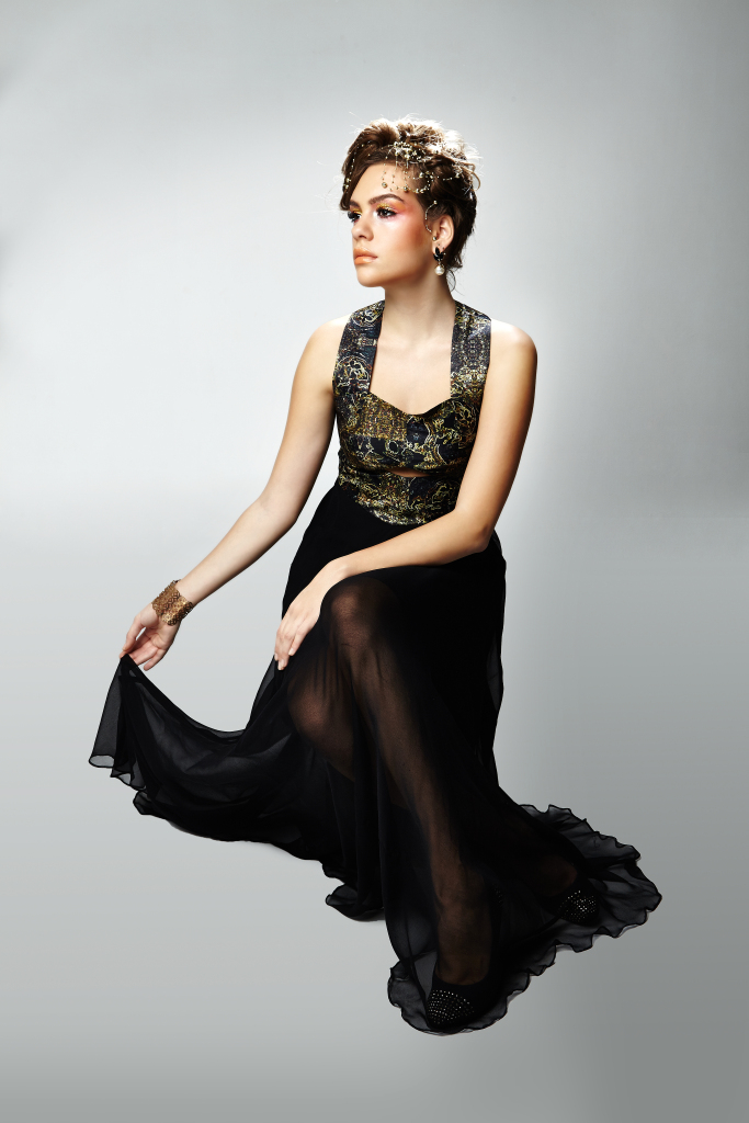
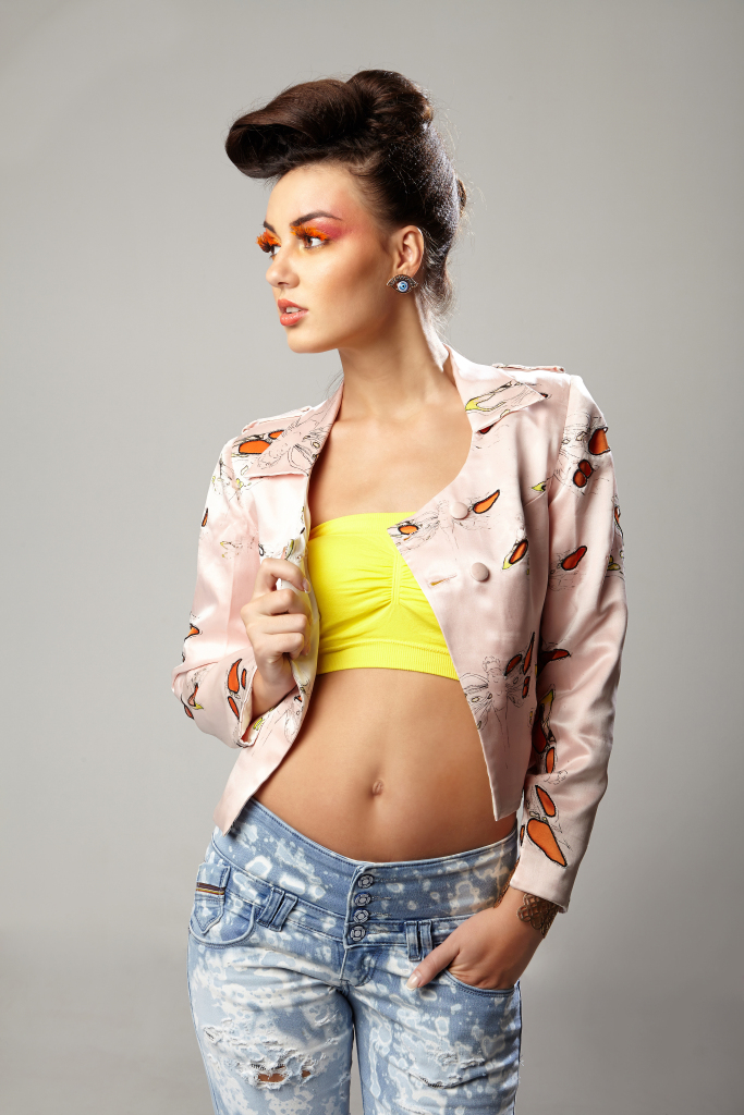
Using some imagery from my old collection shoots and collaborations. See how in the left image, Black (well dominantly) shows elegance, power and arrogance, whereas switch right and we see goth, possibly seductive (well this is perspective).
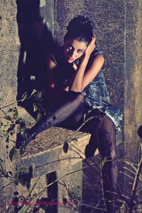
Now, come down and lets see black playing a dominant role as seductive, again a small fun shoot by one of my muses of aeons ago.
I have always loved Black, it’s a colour that defines power and status. A suit in Black defines authority, but did you know it can define mystery as well? Black means it’s a mysterious void to be known and explored, but space travel is not easy! It takes effort! Wearing a black suit to office means the person asserts authority but unseemingly, wearing the little black dress can also mean, she is ready to be explored, might not necessarily/easily be approachable but work your way through it!
The absence of light, like the darkest of interiors, like in pubs and clubs are also given for the naughty to explore! to find the space and release their inhibitions.
Thus! Black can have different meaning in different places or the wearer. It is not a colour for ambience where work is meant to happen, rather where anything out of the ordinary can happen!
Black is also the colour of death or mourning of death, so to unravel the mystery of black, first approach black with caution and work your way to unravel it’s mystery before you proceed to open it’s cork into it’s deep mysterious void!
Of Course! expect certain frictions from the wearer of black as they can be assertive and dominating before you can unravel the feline, after all lions are felines too!
Brownn
There are many hues and saturation levels of brown that give slightly different meanings from each other, so let’s take in general about light brown like yellow ochres to coppers, medium browns like tans to bronze and finally, darker shades of browns such as umber, bark to the reddish darkest of browns. Here, I will also talk about how visual appeal and feeling brown gives when used in ambience/interiors as it’s a common colour used in interiors or exteriors as well in many geographical locations.
For many, Brown is also called granny’s colour, it’s also the colour of the earth which symbolizes either being pragmatic or stubborn, hard like the earth and stone. Bulls and bears are represented by brown as well to show that they are strong and well grounded entities. People who prefer brown can be warm, approachable, honest, pragmatic and realistic; and yet it’s own beautiful subtleties they can also be stubborn and moralistically strong about their values and principles, they might also encourage good conversations but trying to get too close to them as well might turn them off. They might be the quiet ones who can be great listeners but trust me! They only listen as long their temperament allows them to or they are loving what they are listening to.
It’s a down to earth and honest colour. But so much realistic and down to earth can sometimes be termed as boring or a person who has strong values and morals.
Light to Mid browns can also be a neutralizing colour to many strong colours and accents. If you are wearing a strong colour with strong energy like reds, bright blues and/or pinks, paring them with brown can balance the energey radiated by those colours and make you look more subtle.
Now, coming to the one’s who love to flaunt the darker shades especially in leather or the biker, rugged look, can be a more masculine entity, with all of the above qualities, they can sometimes be over bearing and over powering as well, not quite the extrovert, but they can make their point be heard and valued! With ruggedness comes this inert desire to be adventurous as well, but don’t be fooled, they might like to be the explorers of the world and nature both physically and spiritually. I would probably fib about them being like the druids of the old!
Coming into interiors, like I said above, brown can mix with many other colours and neutralize their energy bringing balance to them. They create a feeling of warmth and comfort. Brown allows you to blend with the surroundings, you may/may not like to be invincible but nonetheless, it allows you to be a part of a bigger picture in it’s own subtle way. It’s best to have houses of brown wherein you want to have a place of wholesomeness and warmth; and a place where you wish to comfortably crash in peace!
Blue
Blue is called the colour of honesty and trust, we see similar hues of blue in many organizational logos, iconography of Mother Theresa, Christianity, etc. It brings about a feeling of mutual trust. Lighter Hues of Blue being a cool colour, attracts certain casualness and ease of approachability. Lighter hues to Mid Hues of Blue from sky or powder to about the azure blues brings in a sense of freshness and friendly demeanor. Water being represented by blue is also an incoherent element that easily takes the shape of the vessel it holds, hence, the approachability. It is also the colour of spirituality. Although unlike water, it is considered a selection from the conservative society. It blends well with most colours
The darker shades is a completely different ball game altogether. Along with a sense of trust, it also speaks stability. Thus, the usage in many company logos as well such as linkedin, facebook, ford, intel, infosys, etc.
In fashion dark blue stands for structure and professionalism. He/She is approachable, kind, trustable and polished; and maintains dignity. He/She is not to be messed with or fooled around with, play nice and keep it warm. Keep it dignified! That’s dark blue for you, the cobalts!
The darkest of blues is another mysterious colour in it’s own, the colour of night, the void you stare into the sky and wonder, what secrets behold in that deep dark empty space? They may be naughty or just arrogant, blue mixed with black, exhibit power and stature! Do not go to them and expect a sweet warm feeling. Usually, it’s the introverts who prefer this colour, but dont be fooled! They are not ones to quietly stand aside or be part of the group, they may just be the head of the group.
Coming to denims which have been immortalized with blue through the ages, they may be adventurous, rugged and always open to new experiences. They may be on the bike on the first day and be enjoying a barbeque in the evening. They are casual, approachable and easy to mingle with. The men might prefer to show of their masculinity whereas the women might show their feminine ways, along being casual and friendly. They might be warm to talk to with a welcoming feeling.
In architecture and interiors, blue is a professional colour. Since it gives a warm and welcoming feeling, it is great to use blue wherein communication needs to flow. It is also a very soothing colour to be used with babies around.
Red
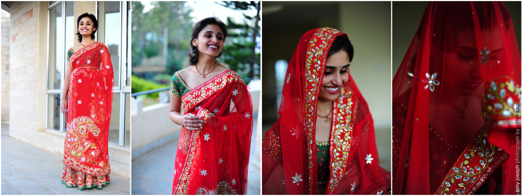
Showing Red, from an Indian Bridal design I worked upon aeons ago, understand, the love and passion radiating from this design.
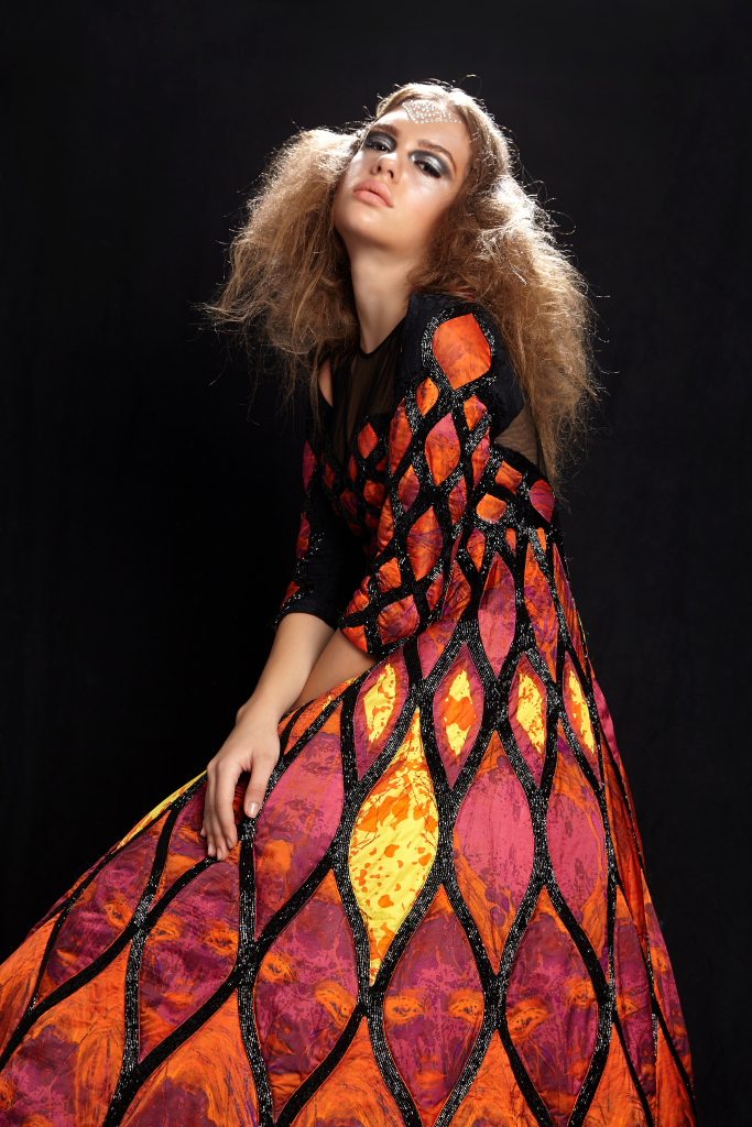
See how the perspective of red as sexy and dangerous, seductive changes perspective here. The left is a goth inspired collection of mine, an older collection called circus of madness, whereas the centre and right set of images are from my recent shoot, from a collection called be my friend, a collection inspired by femme fatale.
Well! What can I say? One of my favorite colours in the entire spectrum. The energy of red is like a passionate unrequited love who knows no bounds or the danger that is limitless. It’s both a passionate loving energy as well as alarmingly dangerous energy! The colour of the setting sun in the evening spectrum as well as that of burning metal and fire.
When a lady wears red, it shows she’s adventurous, probably naughty and is looking to meet someone special who might be available for her, for a lifetime or heck! who knows, just the evening or the young night? She’s courageous and doesn’t shy away from opening up for new experiences. She even likes to go head-on into a collision of passionate love! The colour of the rose that signifies unrequited and passionate love. But there are sharks that swim against the currents and she is looking for an adventure!
Red is also the colour of occasions in many cultures, brides across Asia prefer Red for their weddings, to show passion and love. The colour of the beating heart has many interpretations.
When this turns to black, it displays the vices of the person. It shows their devilish side as well! So, mixing red with black can have multiple interpretations, it can say I’m passionate but naughty as well. I am extroverted. It shows, the duality of the unbridled passion, it’s vices and it’s virtues mixed in a dangerous concoction, a witch’s brew!
Red on men? Well! What can i say? It’s also the colour of the devil, Lucipher! A Black suit with a red shirt is immortalized for a man who plays it naughty and dirty, but a red overall! Hell! Run away from him, for he might not know the bounds of evil. It’s an extroverted notion to have Red as a dominating factor in fashion, especially in men. But with current trends, his intentions can be questionable! (pun intended)
Red on Walls! Well! The Chinese love it. Red ambience infuses hunger which is also the reason, why most restaurants prefer red dominated interiors. It increases one’s energy and enthusiasm when surrounded by red. But, be warned it can have it’s effects emotionally as well.
Pink
Pink is considered a harmonious colour and colour of unrequited love, in it’s purest form.
Well! Another friend of the lovebirds! Not as ecstatic in energy like the Red but a more subtle harmonious energy. Of course! there are the enthusiastic pinks like the shocking pink, which symbolizes passionate love, the other pinks are more subtle and harmonious. We see the usage of light pinks where one wants to be at peace, harmonious and one who loves to blend. She is kind or sweet (however you want to recognize her), her words are sweet and she loves to socialize. She is always the one girl in the group who everyone loves to talk to. She is the face of the group, the perfect girl.
Men in pink are also similar. They are approachable, without rash or rugged intent. They can also be termed sweet, the little candy boys next door. If he’s wearing hot pink! Then run for your life, it’s a scene right out of the old movies! (atleast by today’s trends)
Aphrodite and Paris can be termed as pink people. The beauty in their innocence which almost brought about the fall of troy!
Some prisons also use pink to control disorderly behavior. It is known to diffuse excess energies. Use pink wherever you want peace and calm.
Grey
Another neutralizing colour like Brown, which can be paired with almost everything! With grey you could use it with both the cool colours such as blues and greens, as well as with warm colours such as red and orange. The idea of neutralizing colours such as Grey is to bring about a balance in energies which are radiated by the stronger, more dominant colours.
People who prefer Grey itself as a dominant colour can be considered (safely, I can say this) as introverts who wish to blend with the surroundings rather than be at the centre of a group. They are usually quiet and will converse as much as needed, but maybe not beyond. They are the people who find their strength in being to themselves, or, in other words isolated. Sometimes, even termed as traditional and narrow minded. But, they are not over bearing or arrogant, rather the ones who would comply to other’s wishes or commands.
But, use grey as a neutralizing colour and the game is a totally different ball game altogether. It means, they are in control of themselves and their surroundings, especially when mixed with the warmer shades such as orange, red, wine, purple, etc. They can be interpreted as a control element of the energies of those colours. They bring stability and focus to those energies.
Grey is often used in official spaces to showcase strength and stability. It is also, non invasive and tends to control any type of emotions and feelings. Although, sometimes this can be overbearingly depressing with too much grey. The best way to use it is to always mix it with other colours to control the other colour’s energies and bring more focus. Its a great colour to use it as a compliment, both in architecture as well as fashion to bring about a sense of structure and responsibility.
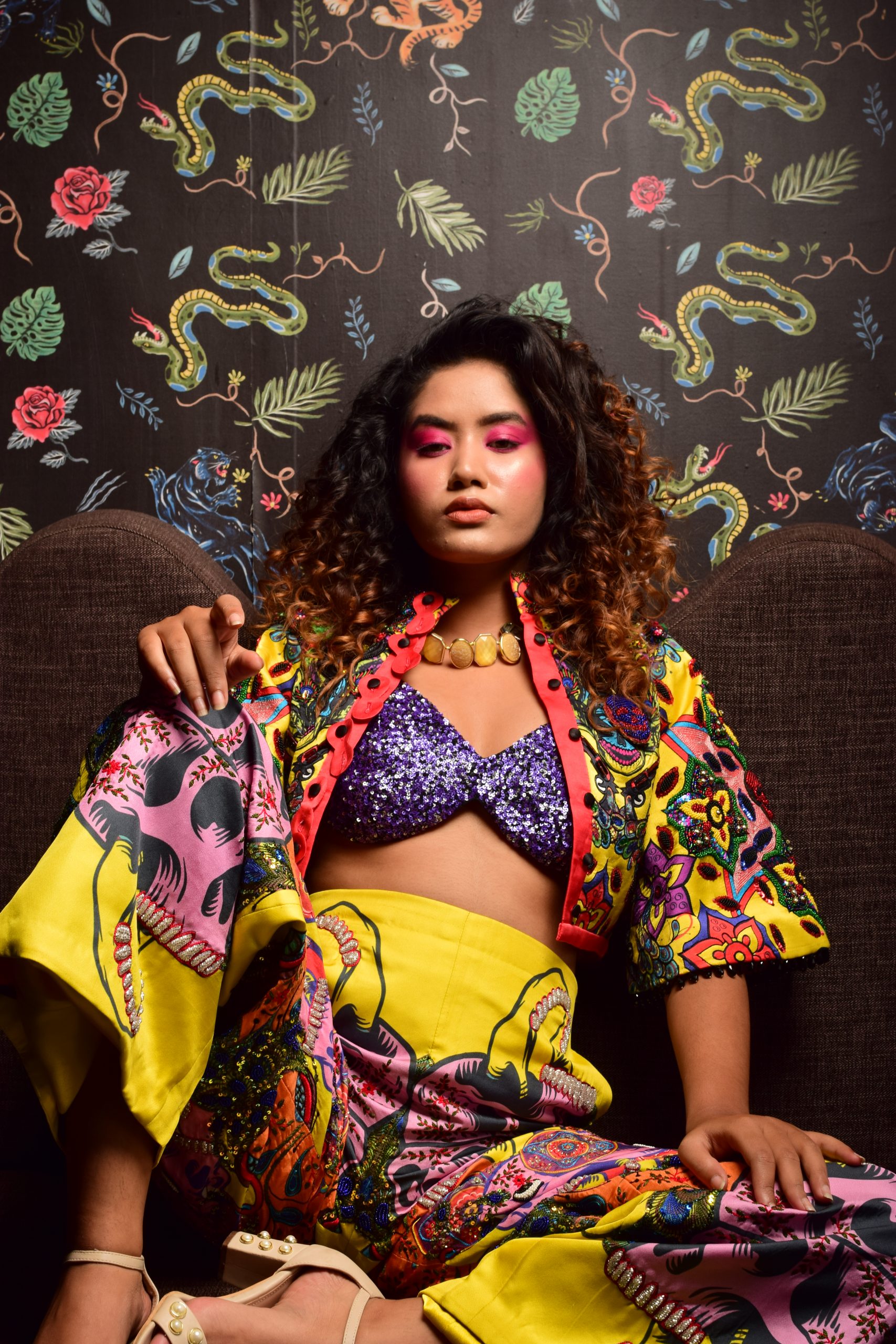
Yellow
Yellow is an extremely powerful colour, and the colour that can be seen from the farthest, also the reason why people use it in traffic signals as a warning to slow down and the traffic might turn red soon. And by this argument, would one want to be noticed that far? Well! I wouldn’t say No! But it is a colour that has that effect, and would one want to be noticed is the question. The colour is also a revered colour in many cultures of the old, the colour of the sun, the colour of life. But the usage of yellow wisely, mostly either as a compliment or as an occasional wear can make the wearer transform into a traffic signal into a gorgeous goddess as well. After all the revered gold is also considered a variation of yellow and follows the same rule. One can see these colours as compliments or as accessories or add on to garments. But there are other rules of design as well, wherein (as I have said before in this blog), Yellow’s strong energy can always be complimented by cool colours or muted down by neutral colours in good balance and there is the god particle of fashion when playing with yellow.
In terms of surrounding, surround yourself with yellow when you want to activate your life or when you want to have a fresh start. It is full of happiness and activity. It also radiated creative and intellectual energies. Creative people can surround themselves with yellow as well. It helps clear the mind and allows us to focus, but be warned, too much of it can also create disharmony and distrust.
Orange
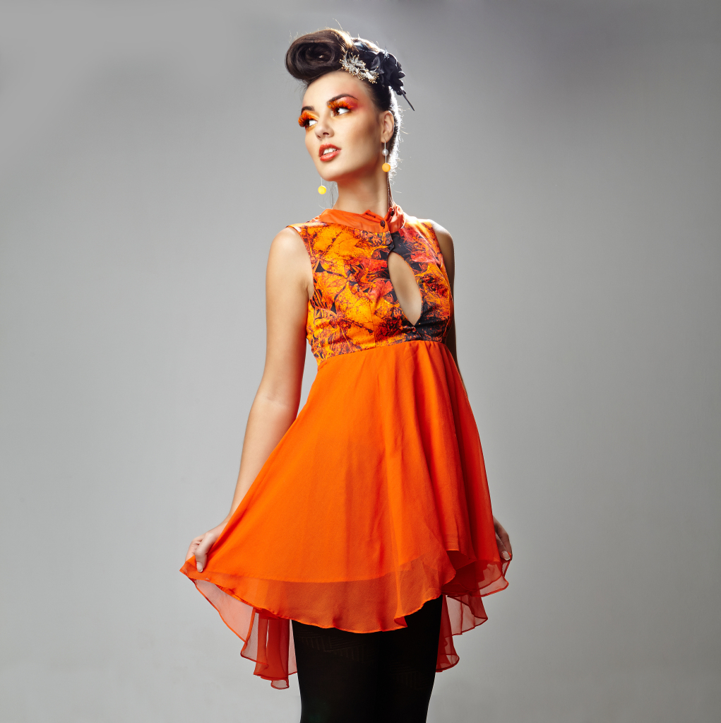
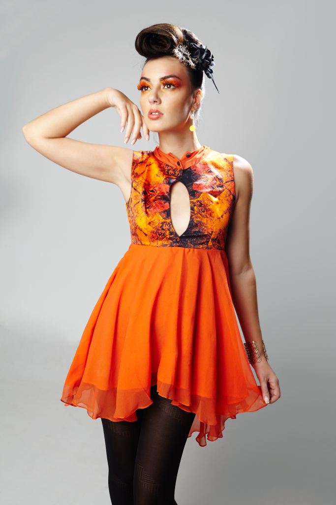
Here, we see Orange being pleasant and harmonious, a controlled energy but full of vitality, some imagery from my older collections.
Orange is called the elder, more mature brother of yellow, the colour that accompanies dawn and dusk. It is also the colour of spirituality, mostly used by the Asians such as Hindus and Buddhists. It is a vibrant colour with a lot of vitality along with mature endurance. This also, like yellow, encourages creativity but in a more subtle, mature way. It allows us to take careful decisions and look forward in a more sustainable manner. But, unlike yellow, too much of orange, never exists. It is a peaceful colour. It shows maturity and simplicity, evokes creativity but in a more restrictive and careful manner, not like a yellow bomb. It is vigorous but thoughtful. It means it can stand strong for longer. A person wearing orange means he is strong, thoughtful, takes careful decisions and thinks in a more sustainable manner. It also means he could be spiritually inclined. Definitely this is a harmonious colour to be worn as a main or more dominant colour, as it never hurts the viewer rather gives a pleasant, approachable and mature feeling.
Green
Here, we see Orange being pleasant and harmonious, a controlled energy but full of vitality, some imagery from my older collections.
Green, also like yellow, is considered the colour of life, the colour of nature and fruit & vegetable, thus life. But, unlike yellow being a warm colour full of energy, Green is more subtle and a cool colour. But, the beauty of greens in nature can be interpreted many ways. When you wear the light and bright greens, you are saying, you are dependable, filled with energy and freshness, whereas go to the duller greens like moss, and it might even mean you are dull and lifeless. Although, use it as a compliment with other colours like Blacks, and greens become more dominant and radiates more energy and life, mix it with the neutral colours like brown and grey and it’s a killer of all energy, dull and lifeless. Dark green, is a different game altogether, it radiates power, but also says, I am not arrogant, rather approachable, but, keep the distance and don’t get personal. It means I am looking for growth and balance.
Surround yourself with green when you are looking for growth and balance, and, protection from fear and anxieties (the brighter nature greens like leaf green), but use the duller shades to have the opposite effects of hatred and mistrust. Be careful in how you use green as it can be misinterpreted in many ways.
White
Here, I am also showing a few collections of mine which you can check out at the Aphrodite by Nags website. Broadly, in my collections above, left picture, the top adhere to the trend; and the gown in centre is in the game as well, the right image is giving an Indian flavour to the trend.
For millennia we are conditioned to understand white is the colour of purity, it is the presence of light! Of course! It is associated with Christianity, Politics and wherever someone wants to represent the purity of their intent. And hence, a white shirt is also the formal colour of choice. White buildings stand out and display wherever responsibility and action towards the betterment of certain society/sects needs to be displayed, the best example I can give here is the White House. It is also the choice of brides in the western world. The virgin is represented by the whites.
White is also the colour of friendship in the western world. When someone presents a white rose to someone on Valentines day, it literally means He/She wants to be his/her friend. White daisies are also a symbol of loyal love.
In art and design we do not consider white as a colour, rather the manifestation of all the different spectrums of the colour waves.
When someone uses white as a dominant colour in their wardrobe it means they want to represent purity of thought and deed; and taking responsibility to one’s duty. They also want to mean themselves as being approachable and responsible. They might .sound sweet and nice but they might only converse as to what is necessary. With all the wonderful things associated with white, do not forget white is also the colour of ice and all things cold. So, cross your line and your might understand how the white might send a chill and shiver to your bone.
Using white can bring about fresh and new ideas in architecture, helps declutter your mind, usually used to show new beginnings.
Published by Nageeshwar C/Aphrodite by Nags
An alumnus of National Institute of Fashion Technology, Bangalore and a professor with over 10 years of teaching experience in institutes across Bangalore such as WLC India., Icat India, Iift and Nift, Bangalore, and various other institutes. He has also delivered hours as a guest faculty and also conducts many workshops. A philanthropist through the Round Table India movement. He loves to bike and always enthusiastic to meet new people; and experience new adventures! His interest has always been in the geometry of patterns and loves to play with form. An avid fan of rock, country and pop music, many a time music itself has been his inspiration.
‘8’ Body Shape or the Hourglass Body – What to wear for your body type?
Category | June 05, 2021

Menswear: Looking Dapper: What to wear: Based on Body Types and Skin Colours: Boys and Men: Menswear plus tips and tricks.
Category | June 05, 2021

Fashion Photoshoots and Collaborations (Collabs)
Category | June 05, 2021
Fashion Designers – What to do and What not to do for young designers and aspiring designers
Category | June 05, 2021
Skin Tones and Colours that suit your skin Tone
Category | June 05, 2021