The Elements of Fashion Design
Category | June 05, 2021
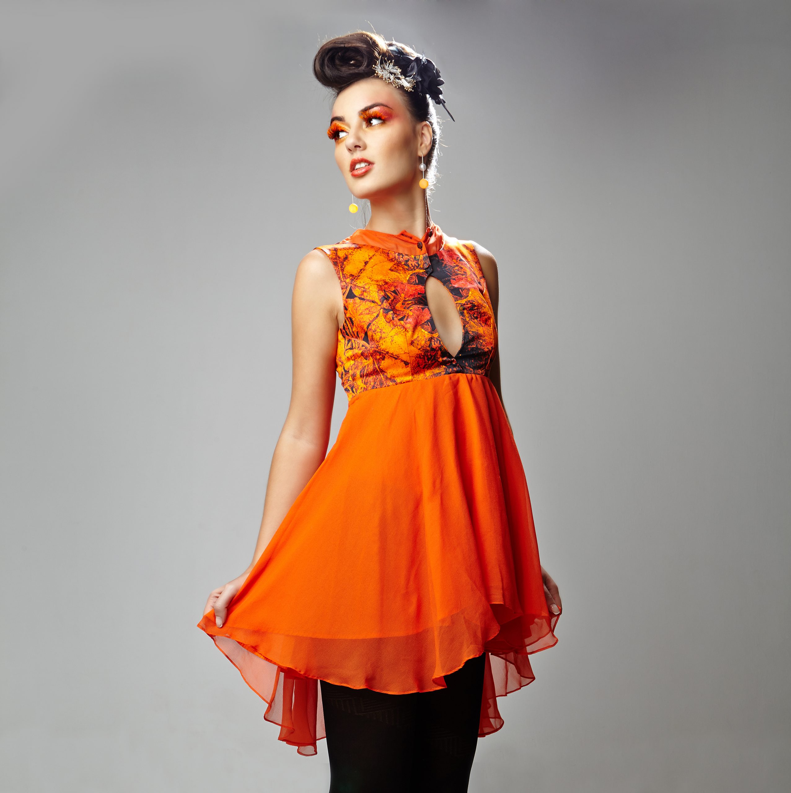
We have all heard of Elements and Principles of Art & Design. Principles such as Balance, Unity, Emphasis, Repetition/Pattern, movement, rhythm, harmony, etc. Now these principles remain the same across all design/art fields, since these are more directional towards the approach we wish to follow in our works/products.
Also, information about the above is available, literally in abundance across the internet. With a simple search, we can get more and enough information about the principles and elements of art/design.
*But I will be taking references to the principles in this blog if, in relation to the elements I wish to explain, please understand, this is for better understanding and elaborating the usage of the elements and how principles of art/design are affected by the usage of these elements
But here I will explain (according to me or in my perception) about the elements of Fashion designing. Now what are elements? Let me answer that question first!
Elements are physical entities that can be used towards making a product/design/piece of art. Now what are these entities? Like the given space for a designer/artist to make his/her product/artistic piece such as a canvas for an artist, a plain mug for a designer/artist to decorate, a piece of cloth for a designer to make it into a product, etc., similarly when we talk about another element such as colour, then using the element of colour, what are the primary and complimentary colour palette/surface that the artist/designer wishes to achieve on his/her product/piece of art?
Without further ado, what are the physical entities that define a particular product, in this sense, a garment?
In Fashion design I can list about 5 definite elements which can further be broken into sub lists under certain elements, I am breaking in the sub list so as to explain better and for the reader to understand better and more clearly. They are:-
- Silhouette (pattern, similar to shape/form)
- Colour
- Textile/Fabric
- Surface (can be further divided into 2D & 3D which I will explain further)
- Trims & Details
So what do these elements mean and how can we use them? Or a better question would be, how would it profit the design/garment/product by using these elements and to what extent? Although I wouldn’t get into the details of extent as the topic moves towards principles in that sense and its not my place to judge as each one’s aesthetics can be different; and also, the fact we are not concentrating on principles in this blog.
*Also, please note I will be using imagery from my own designs/shoots to avoid any conflict of interest
Silhouette
Silhouette in fashion design can be described (in my own words) as a final shape/form that is to be achieved from the product. Fashion is a 3 dimensional space, the art of beautifying/decorating the human body. It could the play of achieving a certain volume or a certain fit or a certain shape.
And, how does one achieve this? Like I have said in my previous blog – ‘The importance of technical knowledge in Fashion Design and the Basic Skill Set’, its achieved through Pattern Making/Draping. Using basic Geometry skills and understanding of a 3D form of Basic Human Anatomy.
Using a 2D space we achieve a 3D form using pattern making/draping techniques.
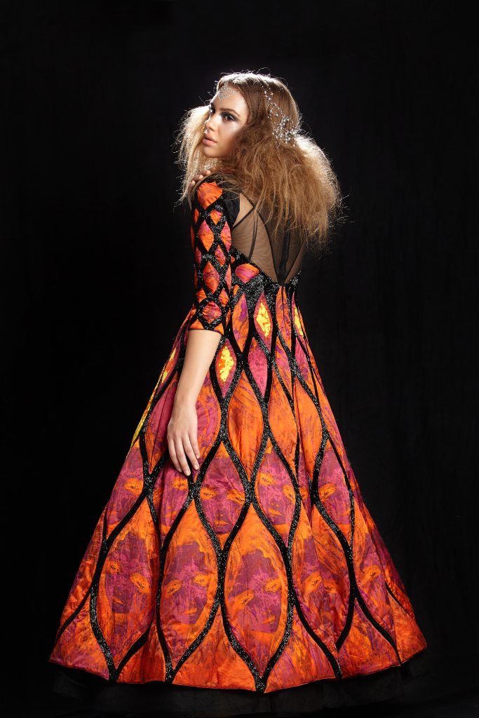

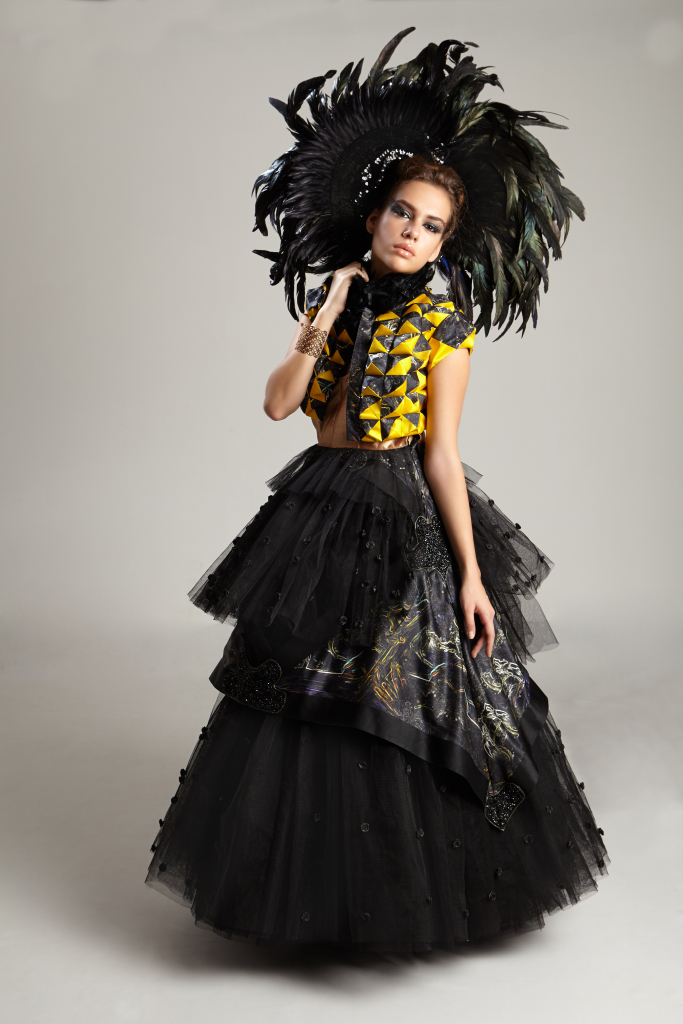
Understand here that all three garments have a different intended silhouette/shape, the left one which fits till the waist and flares towards the bottom, the centre image has a fit, following the contours of the body all the way, the right image speaks of achieving a certain volume all over.
Colour
The human eye can differentiate about 6 million colours and what is colour? The different shades of hue and/or saturation that is possible due to the reflection of different wavelengths of light, Okay! this might sound technical, which, I will not delve into, rather let us understand this a gift given to us and how, as designers we can use them.
The element of Colour can be used to obtain many principles such as Harmony, emphasis, contrast, etc, by the usage in quantity of the chosen colour palette.
In fashion design and in most design paths we create colour palettes so as to understand their relationship with the concept/look we are trying to achieve. And, usually we have 2 palettes per concept/product. They are
Primary/Main Colour Palette – The set of colour/colours which have more emphasis in the product as a direct relation to its perception, for example:- like when we want to portray a strong emotion/feeling such as danger/love/passion which do not have control, we tend to use the colour red which is a colour with abundance of energy or uncontrolled energy, whereas we would shift towards lighter shades of pink, which has a more controlled and harmonious energy. Similarly when we want to portray abundance of happiness, we would choose to use yellow which is again a colour with abundance of energy, whereas we could use hues of orange, which is a more controlled and harmonious energy; or white to show peace and tranquillity, blue is the colour of trust, etc.
Complimentary Colour Palette – Compliments are smaller details/lesser usage of a given element to be used to accentuate/highlight/compliment a colour/element with more emphasis.
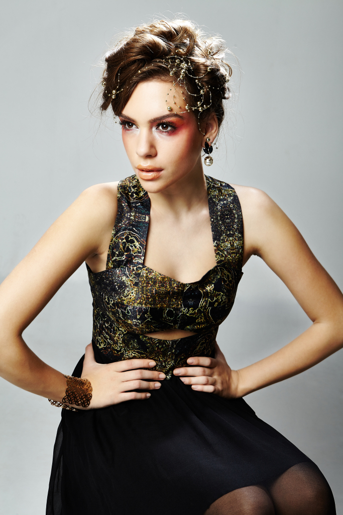
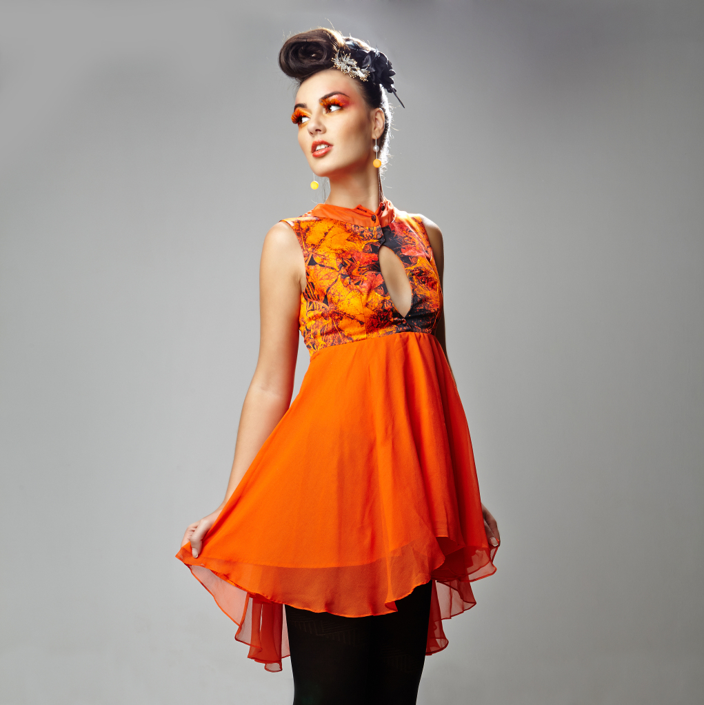
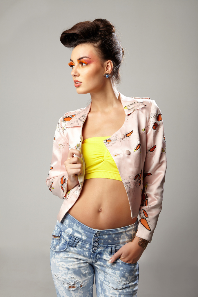
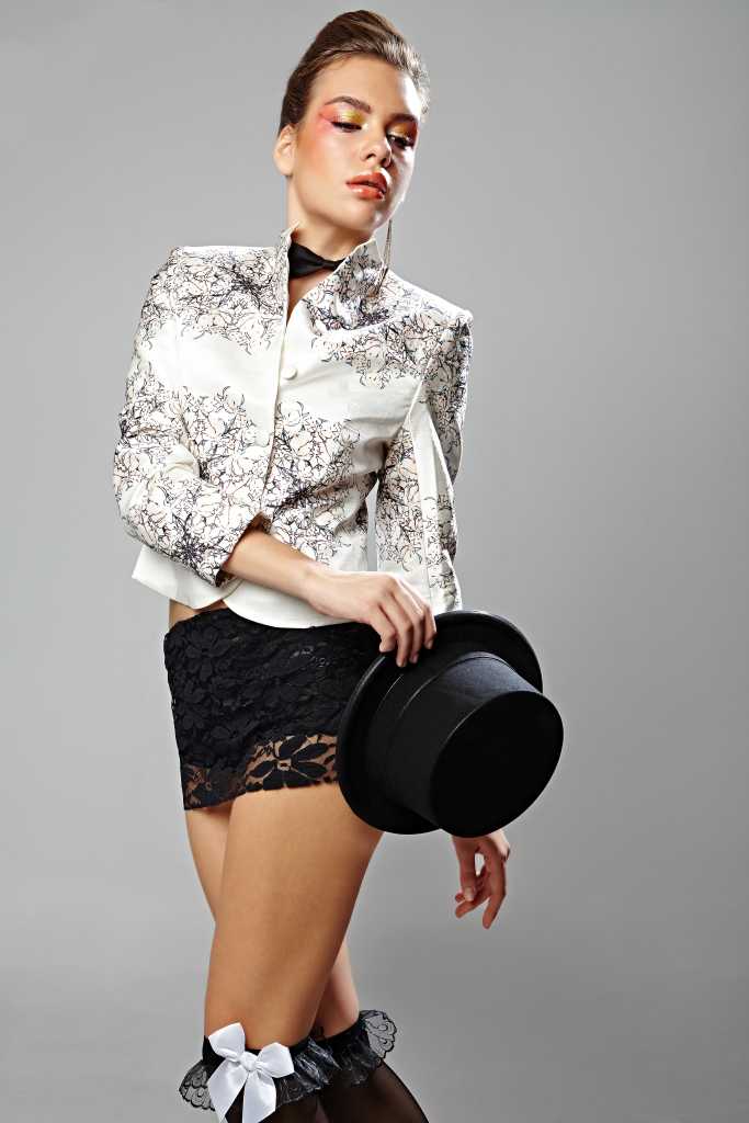
All three images are from the same collection called, ‘the crow, the sparrow and the dragonfly herald’, in this concept I wanted to show the diminishing of these beautiful creatures diminishing in our daily loves due to the expansion of urbanization. In the left garment we can see that it is a dark palette with little colourful compliments to show a negative prospect, whereas in the centre and right images we show more harmonious/peaceful main colour palette with dark compliments to show that there is still hope and there is still beauty in existence.
I would also suggest the user to have a read about the colour concepts – colour wheel theories such as Primary Colour, Secondary Colours, Tertiary Colours Complimentary Colours – 2 colour, 3 colour, 4 colour and so on, Analogous, triadic, etc
Of course! They are not said and final theories, but, rather guidelines for the uninitiated towards a wiser use of colour palettes for the given product to be designed
I would also suggest some light reading towards Meanings of Colours which could give better understanding to transform a concept towards a tangible colour palette.
Textile or Fabric
Any woven, non woven or knitted fabric can be used under the heading of textile/fabric. Sometimes experimental materials can still be used for avante-garde fashion (publicly unwearable costumes – to better understand this area I would suggest blogs/website related to World of Wearable art) as well.
We could consider the weave/knit/any other technique intended towards affecting the drape/fall/ structure of a particular fabric. But I wouldn’t consider the motifs/colours/other surfaces obtained as that would fall under the categories of colour or surfaces, rather the feel/touch of the fabric, the drape/fall/structure of the fabric; and other terms that affect the state of the product due to the manufactured method of the fabric such as thickness, transparency, etc.
For example:- The drape of medium/heavy weight Linen/Cotton is more restrictive compared to most silk varieties which has more/better drape and fall, thus, volume in both these fabrics will behave differently.
Surface (2D surfaces & 3D surfaces)
Surfaces in fashion can be defined as any treatment done upon a space (in the case of fashion design – textile) to achieve a certain look/in some cases form as well. I have divided this element into 2 Dimensional and 3 Dimensional, let me explain:-
- 2 Dimensional Surfaces – 2 Dimensional surfaces can be defined as any treatment such as weaving/printing/knitting/stitch lines to achieve an intended colour, motif and/or design. Using principles such as emphasis, pattern/repetition, etc. in breadth and width of the given space.
- 3 Dimensional Surfaces – Can be defined as any treatment such as embossing, surface ornamentation, melting, repeat printing, etc. to achieve an intended 3D treatment.


The left and centre images show the 3D treatment of surfaces in two different possibilities – the left being the small pyramid structures achieved by pattern making, the centre image shows surface ornamentation. The right image shows 2D treatment using printing techniques.
Trims & Details
Trims and detailings in Fashion can be explained as the little details such as closures, bands, pockets, stitch lines, etc. and other materials used to towards a function (in some cases not necessarily, it can even be purely ornamental but in such cases they may fall under surfaces). Now this is one of the most important element in mass manufacturing, as every penny in manufacturing matters, yet, without sacrificing on aesthetics nor the product’s functionality; although, in couture/avante-garde it can purely be only on necessity without paying much attention to it’s functionality.


In the left image we can define both pockets and closures under trims or detailing, whereas in the centre and right images we see the closure. In the centre image we can also define the cuff as detailing.
Do note, many a time this particular element can be confused with the surfaces element, but in most cases only trims and detailing can/need not add to the aesthetics of the garment but necessarily is derived from a necessary function in the garment, like even a stitch line to join two panels of a garment is a trim or detail whereas a stitch line or multiple stitch lines used purely for decorative purpose and not for a necessary function is a surface treatment.
With this, I hope the reader understands the basic elements of design and it’s usage. Of course! there are many authors out there who might specify less or more number of elements but primarily (in my opinion/perception), these are the basic elements, any other specification one can think of, can come as a sub list of the above stated elements.
So, when I am to design any product, it has been a habit for me to break up the product in terms of the 5 elements and design/treat design details individually for each of these elements, work out the different possibilities in parts, and then join the different ideas with respect to the elements (even discard the unnecessary details with respect to the elements) as a whole. Although, these I will be discussing in a later blog when I write about design processes, some annotations can be observed in my past blog namely – The importance of the ‘Black Book’ for every designer.
Published by Nageeshwar C/Aphrodite by Nags
An alumnus of National Institute of Fashion Technology, Bangalore and a professor with over 10 years of teaching experience in institutes across Bangalore such as WLC India., Icat India, Iift and Nift, Bangalore, and various other institutes. He has also delivered hours as a guest faculty and also conducts many workshops. A philanthropist through the Round Table India movement. He loves to bike and always enthusiastic to meet new people; and experience new adventures! His interest has always been in the geometry of patterns and loves to play with form. An avid fan of rock, country and pop music, many a time music itself has been his inspiration.
‘8’ Body Shape or the Hourglass Body – What to wear for your body type?
Category | June 05, 2021
Menswear: Looking Dapper: What to wear: Based on Body Types and Skin Colours: Boys and Men: Menswear plus tips and tricks.
Category | June 05, 2021

Fashion Photoshoots and Collaborations (Collabs)
Category | June 05, 2021
Fashion Designers – What to do and What not to do for young designers and aspiring designers
Category | June 05, 2021
Skin Tones and Colours that suit your skin Tone
Category | June 05, 2021